This vignette will describe how to visualize data using grandR in different scenarios. In addition to QC plots (see the differential expression and kinetic modeling vignettes) and vulcano/MA plots (see the differential expression vignette), the plotting functions in grandR consist of
- Gene-wise visualizations and
- Global visualizations (scatter plots, heatmaps)
All plotting functions operate on grandR objects and return ggplot2 and ComplexHeatmap objects, which can, in principle, be further customized (see below). Both kinds of plots can be used in a shiny-based web interface for exploratory data analysis.
Gene-wise visualizations
All functions that visualize data for a single gene start with
PlotGene. We demonstrate the first few using the BANP data
set 1.
These are SLAM-seq data from multiple time points (1h,2h,4h,6h and 20h)
after acute depletion of BANP. We first load and preprocess these data
as usual:
banp <- ReadGRAND("https://zenodo.org/record/6976391/files/BANP.tsv.gz",design=c("Cell","Experimental.time","Genotype",Design$dur.4sU,Design$has.4sU,Design$Replicate))Warning: Duplicate gene symbols (n=34, e.g. Olfr912,Gm2464,4930556M19Rik,Ccl27a,Rnf26,Gm3055)
present, making unique!
banp <- FilterGenes(banp)
banp <- Normalize(banp)
Refer to the Loading data and working with grandR objects vignette to learn more about how to load data.
The most basic plots are to just showing the raw data (from the default slot, by default shown in log scale; both can be changed via parameters):
PlotGeneTotalVsNtr(banp,"Tubgcp5")
PlotGeneOldVsNew(banp,"Tubgcp5")
By default replicates (if present in the Coldata table)
will be shown as the point shapes, and conditions as colors. Here we do
not have a Condition, so let’s add this (and show only the new vs. old
plot, as this works the same way for the total vs NTR):
Condition(banp) <- c("Genotype","Experimental.time.original","has.4sU")
PlotGeneOldVsNew(banp,"Tubgcp5")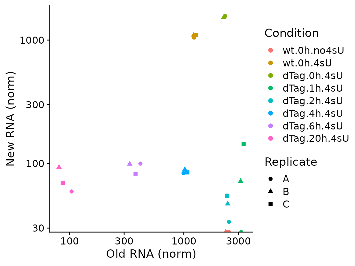
Since the plotting function return standard ggplot object,it is easily possible to add titles or to change the aesthetic mappings (i.e. the usage of shape for replicates and colors for conditions) via the aest parameter and the way they are displayed via ggplot’s scales:
PlotGeneOldVsNew(banp,"Tubgcp5",aest = aes(color=Genotype,shape=factor(duration.4sU)))+
  scale_color_brewer(palette="Dark2")+
  ggtitle("Tubgcp5")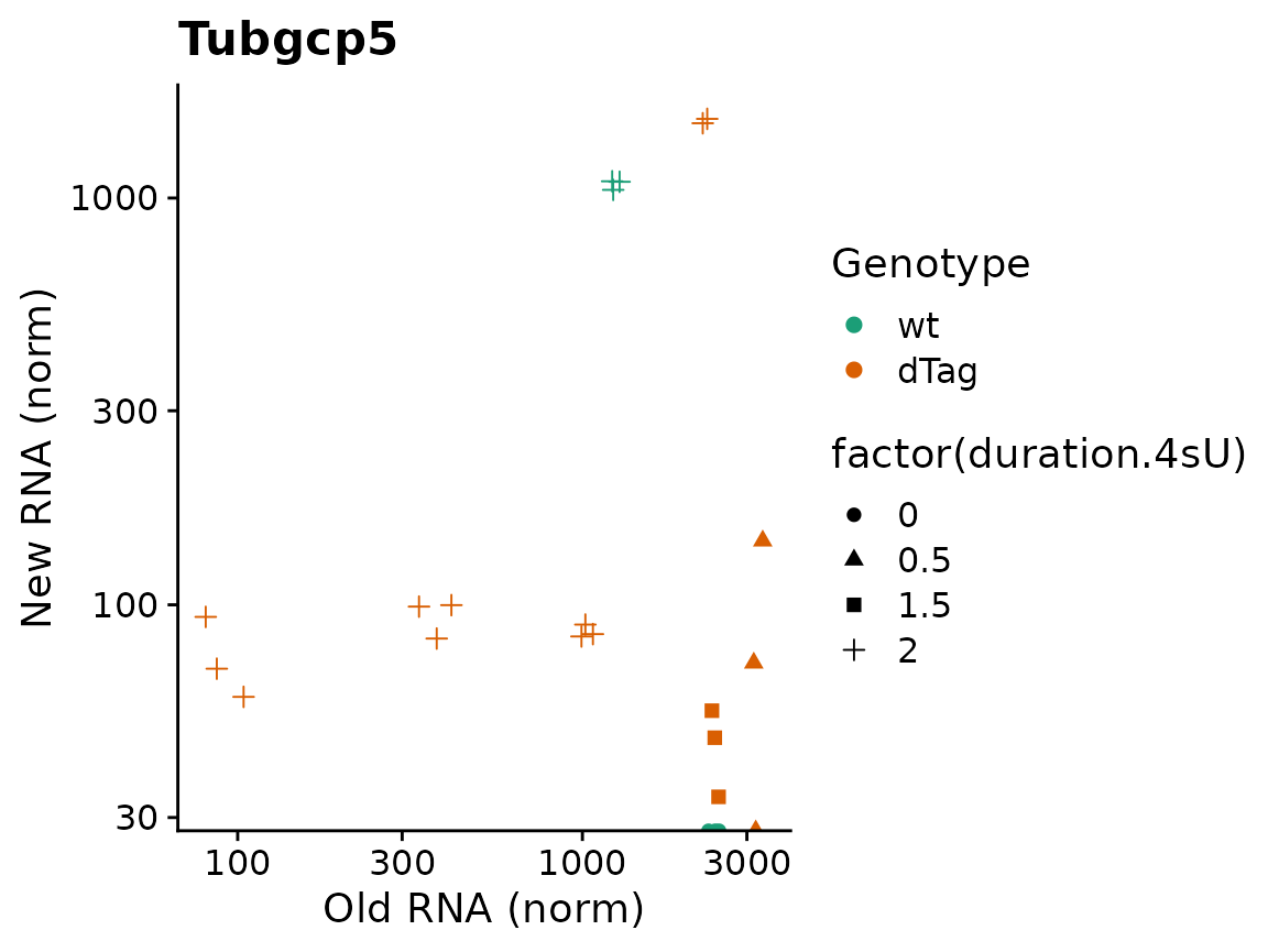
Both plotting functions also offer to plot credible intervals. These
must be precomputed using ComputeNtrCI. Note here that
PlotGeneOldVsNew returns a plain ggplot2 object, so we can
easily further customize it (here: restrict the y axis, which would
otherwise be extended way down due to the large CI of one of the
points).
banp <- ComputeNtrCI(banp) # creates data slots "lower" and "upper"
PlotGeneOldVsNew(banp,"Tubgcp5",show.CI = TRUE)+
  coord_cartesian(ylim=c(30,3000))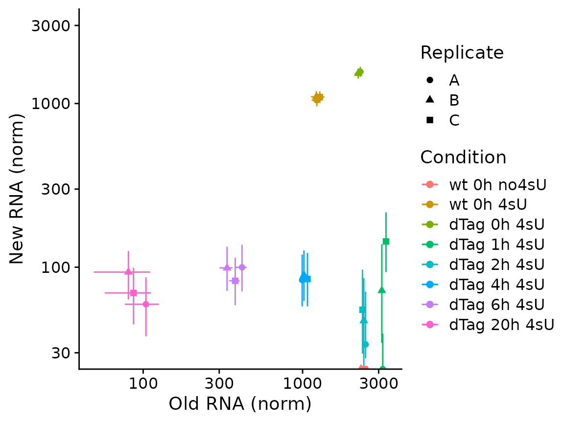
These visualizations are sometimes hard to interpret. In such
situations, it makes sense to only plot either old, new or total RNA on
the y axis, and group samples on the x axis. By default,
PlotGeneGroupsPoints will group the points according to the
Condition (which can be changed via the group parameter).
To demonstrate, we plot new RNA from the norm slot (by using the
mode.slot syntax new.norm for the mode.slot parameter),
show credible intervals, and specify custom colors:
PlotGeneGroupsPoints(banp,"Tubgcp5",mode.slot="new.norm",show.CI = TRUE,aest=aes(color=Genotype))+
  coord_cartesian(ylim=c(30,3000))+
  scale_color_manual(values=c(wt='gray50',dTag='red'))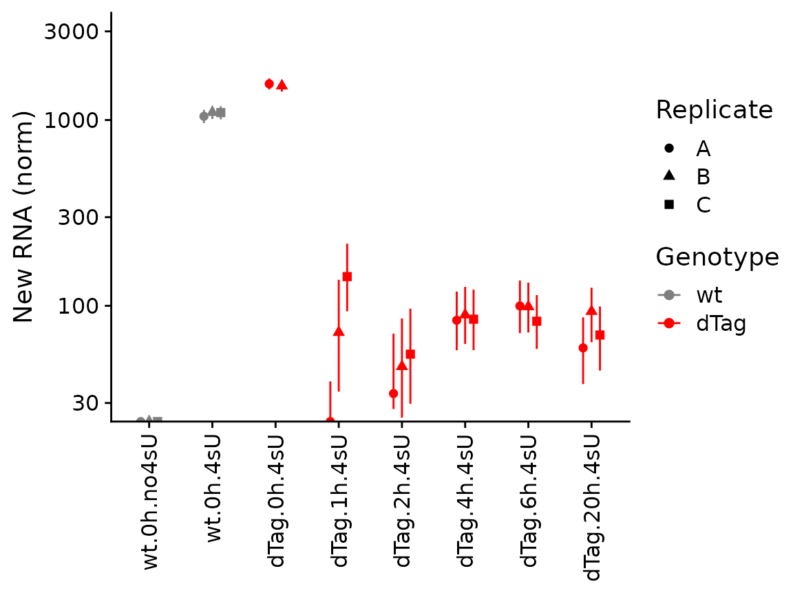
The last of the basic visualizations shows old (gray) and new (red) RNA as bars (and here we change the way the samples are labeled on the x axis):
PlotGeneGroupsBars(banp,"Tubgcp5",xlab=paste(Condition,Replicate,sep="."))
grandR also provides more sophisticated plotting function for time
courses. A time course can either consist of several snapshots or it can
be a progressive labeling time course (i.e. labeling was started at the
same time point for each sample, or, in other words, the experimental
time is equal to the labeling time). For snapshot data, we can use the
PlotGeneSnapshotTimecourse function. This function will
plot time course per condition, and right now each time point belongs to
its own condition as defined above. Thus, we will just remove the
condition for now. Furthermore, the wt Genotype doesn’t have annotated
experimental times, so we remove these samples as well:
banp <- subset(banp,columns = Genotype=="dTag")
Condition(banp) <- NULL
For PlotGeneSnapshotTimecourse we need to define the
time parameter corresponding to the experimental time, which is here the
time since depleting BANP:
PlotGeneSnapshotTimecourse(banp,"Tubgcp5",time="Experimental.time")
We can also change this to not plot in log scale, plot new RNA and show credible intervals:
PlotGeneSnapshotTimecourse(banp,"Tubgcp5",time="Experimental.time",log=FALSE,
                           mode.slot="new.norm",show.CI = TRUE)
If you have multiple conditions, it will automatically show them as colors (here we don’t have conditions, so we just treat the replicates as separate conditions; we also show the NTR instead of new RNA):
Condition(banp) <- "Replicate"
PlotGeneSnapshotTimecourse(banp,"Tubgcp5",time="Experimental.time",
                           mode.slot="ntr",show.CI = TRUE)
These data consist of a timecourse of several snapshots. There is
also another kind of timecourse: progressive labeling. This means that
the 2h time point also had 2h of labeling, and the 4h timepoint had 4h
of labeling etc. Such data can be visualized using
PlotGeneProgressiveTimecourse. To demonstrate this, we
first load and process the data set from Finkel et al. 2021 [2]. The
data set contains time series (progressive labeling) samples from a
human epithelial cell line (Calu3 cells); half of the samples were
infected with SARS-CoV-2 for different periods of time.
sars <- ReadGRAND("https://zenodo.org/record/5834034/files/sars.tsv.gz",
                  design=c("Condition",Design$dur.4sU,Design$Replicate),
                  classify.genes = ClassifyGenes(name.unknown = "Viral"))
Warning: Duplicate gene symbols (n=17, e.g. SPATA13,HIST1H3D,TXNRD3NB,SDHD,EMG1,COG8) present,
making unique!
sars <- FilterGenes(sars)
sars <- Normalize(sars)
sars <- ComputeNtrCI(sars) # creates data slots "lower" and "upper"
Now we can use it to plot time courses. The function will use the
Condition field and generate a panel (ggplot facet) for
each condition. Just like above, here we will also plot credible
intervals of the NTR quantification. In addition to data points, the
plotting function will also show the model fit. For that to work, here
it is important to specify the steady state parameters. For more on
this, see the kinetic modeling
vignette.
PlotGeneProgressiveTimecourse(sars,"SRSF6",show.CI = TRUE,steady.state=c(Mock=TRUE,SARS=FALSE))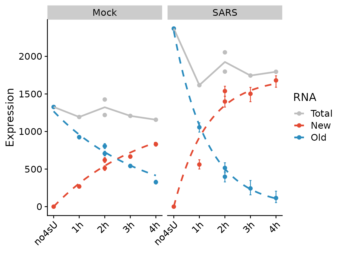
We can also fit the kinetic model using the Bayesian method (which inherently assumes steady state, and actually is not appropriate for the “SARS” condition). Note that the visualization changes to indicate that this method does not use the quantification of RNA abundances at all.
PlotGeneProgressiveTimecourse(sars,"SRSF6",type="ntr",show.CI = TRUE)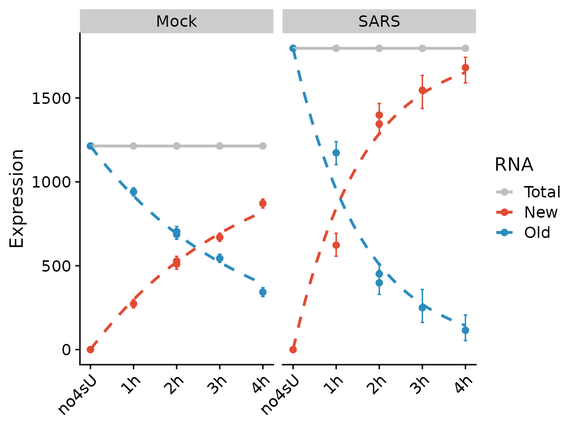
Note that the SARS condition, which is not at steady state, is not fit will.
Global visualizations
grandR implements two convenience functions to create (i) scatter plots and (ii) heat maps from grandR data.
PlotScatter
Scatter plots are frequently used to provide a global overview over
two variables. A straight-forward example is to compare expression
values from two samples (i.e., here the x and
y parameters are sample names from the data set):
PlotScatter(banp,x="mESC.0h.dTag.2h.4sU.A",y="mESC.0h.dTag.2h.4sU.B")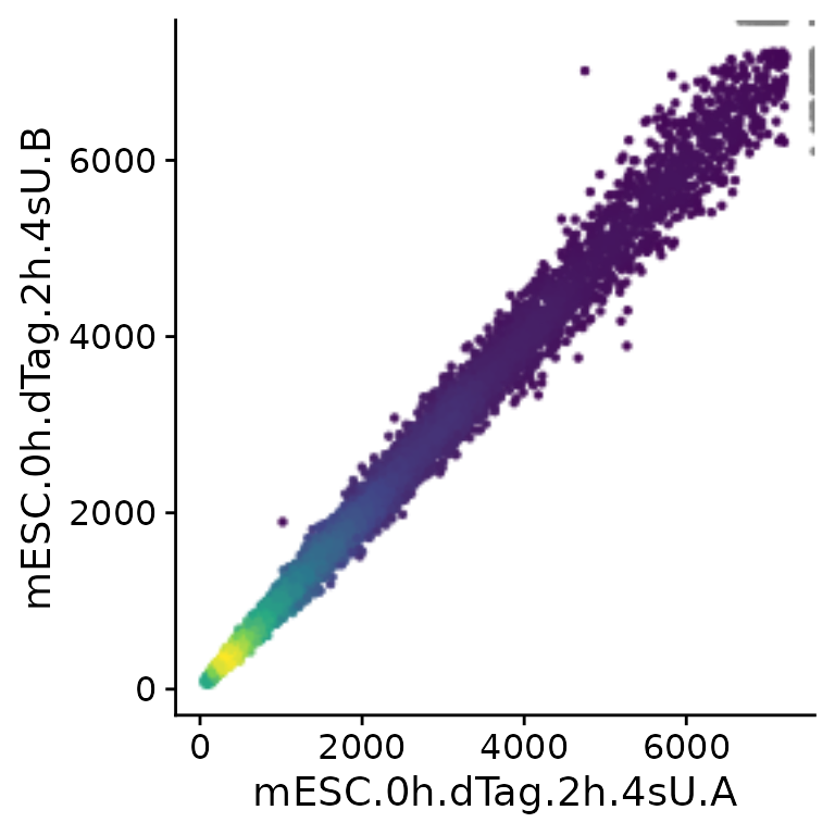
Note that PlotScatter automatically cuts outliers (shown
at the upper right corner in gray) to focus on the bulk of the genes
(see below how to modify this behavior), and that it shows dense regions
(with many genes) by brighter colors.
PlotScatter can also display results from analyses (see
the differential expression
and kinetic modeling vignettes for
more information on analyses). To demonstrate, we first create some
analyses results:
contrasts <- GetContrasts(banp,contrast=c("Experimental.time.original","0h"))
banp <- LFC(banp,name.prefix = "total",contrasts = contrasts)
banp <- PairwiseDESeq2(banp,name.prefix = "total",contrasts = contrasts)
Warning in AddAnalysis(data, name = if (is.null(name.prefix)) n else paste0(name.prefix, :
Analysis total.1h vs 0h already present! Adding: S, P, Q, Overwritting: M, keeping: LFC...Warning in AddAnalysis(data, name = if (is.null(name.prefix)) n else paste0(name.prefix, :
Analysis total.2h vs 0h already present! Adding: S, P, Q, Overwritting: M, keeping: LFC...Warning in AddAnalysis(data, name = if (is.null(name.prefix)) n else paste0(name.prefix, :
Analysis total.4h vs 0h already present! Adding: S, P, Q, Overwritting: M, keeping: LFC...Warning in AddAnalysis(data, name = if (is.null(name.prefix)) n else paste0(name.prefix, :
Analysis total.6h vs 0h already present! Adding: S, P, Q, Overwritting: M, keeping: LFC...Warning in AddAnalysis(data, name = if (is.null(name.prefix)) n else paste0(name.prefix, :
Analysis total.20h vs 0h already present! Adding: S, P, Q, Overwritting: M, keeping: LFC...
banp <- LFC(banp,name.prefix = "new",contrasts = contrasts,mode="new", normalization = "total")
banp <- PairwiseDESeq2(banp,name.prefix = "new",contrasts = contrasts,mode="new", normalization = "total")
Warning in AddAnalysis(data, name = if (is.null(name.prefix)) n else paste0(name.prefix, :
Analysis new.1h vs 0h already present! Adding: S, P, Q, Overwritting: M, keeping: LFC...Warning in AddAnalysis(data, name = if (is.null(name.prefix)) n else paste0(name.prefix, :
Analysis new.2h vs 0h already present! Adding: S, P, Q, Overwritting: M, keeping: LFC...Warning in AddAnalysis(data, name = if (is.null(name.prefix)) n else paste0(name.prefix, :
Analysis new.4h vs 0h already present! Adding: S, P, Q, Overwritting: M, keeping: LFC...Warning in AddAnalysis(data, name = if (is.null(name.prefix)) n else paste0(name.prefix, :
Analysis new.6h vs 0h already present! Adding: S, P, Q, Overwritting: M, keeping: LFC...Warning in AddAnalysis(data, name = if (is.null(name.prefix)) n else paste0(name.prefix, :
Analysis new.20h vs 0h already present! Adding: S, P, Q, Overwritting: M, keeping: LFC...Because we need this later, we also add gene annotations about BANP targets determined via ChIP-seq:
tar <- readLines("https://zenodo.org/record/6976391/files/targets.genes")
GeneInfo(banp,"BANP-Target")<-factor(ifelse(Genes(banp) %in% tar,"yes","no"),
                                     levels=c("yes","no"))
Now we could for instance compare log2 fold change computed for total and new RNA, respectively:
PlotScatter(banp,x="total.6h vs 0h.LFC",y="total.2h vs 0h.LFC")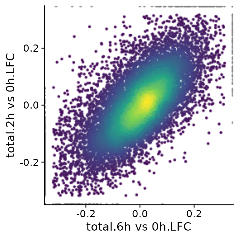
Here, both the x and y parameters to
PlotScatter are character strings that are (i) sample (or
cell, in case of single cell data) names (like mESC.0h.dTag.2h.4sU.A) or
(ii) fully qualified analysis results (like “total.4h vs 0h.LFC”). A
fully qualified analysis result is the analysis name (for “total.4h vs
0h.LFC” this is “total.4h vs 0h”, which is build by the LFC
function used above from the name.prefix parameter - “total” - and the
name in the used contrast matrix - “4h vs 0h”) followed by a dot (“.”)
and the name of the computed statistic (here “LFC”). If you don’t know
what is available so far in your object, call
Analyses(banp,description=TRUE). However, you can also use
arbitrary expressions, that are evaluated in an environment that has
both the sample names as well as the fully qualified analysis results.
Thus, you can also do (if you don’t want to use the
VulcanoPlot function, see the differential expression
vignette; note the backticks since the names contain spaces):
PlotScatter(banp,x=`total.2h vs 0h.LFC`,y=-log10(`total.2h vs 0h.Q`))Warning:
[1m
[22mRemoved 3 rows containing missing values or values outside the scale range
(`geom_point()`).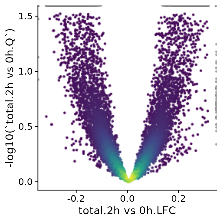
Axes can also be plotted in log scale (there are also parameters
called log.x and log.y), and it is possible to
change the axis labels. PlotScatter returns a ggplot
object, so it is also straight-forward to further adjust the plot to
your needs (e.g. like with ggtitle here).
PlotScatter(banp,x=`mESC.0h.dTag.2h.4sU.A`,y=`mESC.0h.dTag.2h.4sU.B`,
            xlab="Replicate A",ylab="Replicate B",log=TRUE)+
  ggtitle("0h normalized expression")+
  geom_abline()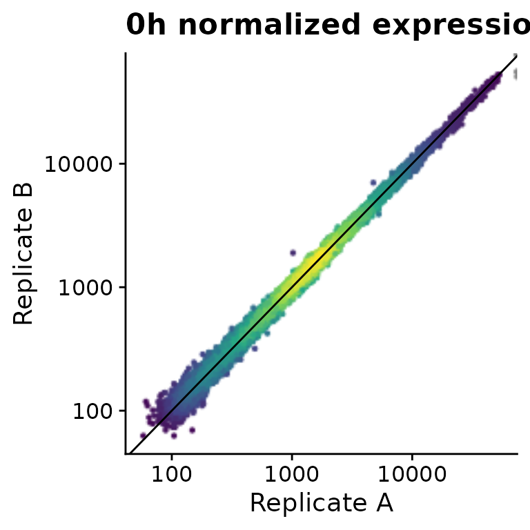
You might have noticed that the outlier filtering for one of the
plots above (the log2 fold change comparison) was too stringent. How
stringently outliers are filtered is defined via the
remove.outlier parameter (the higher, the more points are
included and not defined as outliers), or limits can be defined directly
via xlim and ylim (note that we use the pipe
“|” and division “/” operators defined in the patchwork package to
combine plots):
x="total.6h vs 0h.LFC"
y="total.2h vs 0h.LFC"
(PlotScatter(banp,x=x,y=y,xlab="",ylab="") |
   PlotScatter(banp,x=x,y=y,xlab="",ylab="",remove.outlier = 10)) /
  (PlotScatter(banp,x=x,y=y,xlab="",ylab="",remove.outlier = FALSE) |
     PlotScatter(banp,x=x,y=y,xlab="",ylab="",xlim=c(-2,0.5),ylim=c(-1,0.5)))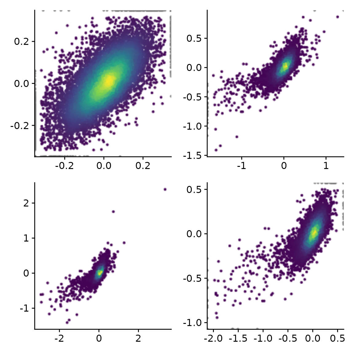
A specific subset of genes (e.g., BANP targets found by ChIP-seq) can be highlighted and specific genes can be labeled:
PlotScatter(banp,x=`total.6h vs 0h.LFC`,y=`total.2h vs 0h.LFC`,xlim=c(-2,0.5),ylim=c(-1,0.5),
            highlight = GeneInfo(banp,"BANP-Target")=="yes",
            label="Thap7")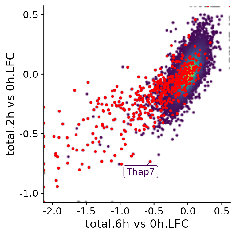
It is also possible to color points according to an annotation in the
GeneInfo table (instead of using the colors from estimated
point densities):
PlotScatter(banp,x=`total.6h vs 0h.LFC`,y=`total.2h vs 0h.LFC`,xlim=c(-2,0.5),ylim=c(-1,0.5),
            color = "BANP-Target")+
  scale_color_manual("BANP target",values=c(yes="blue",no="gray"))
[1m
[22mScale for
[32mcolour
[39m is already present.
Adding another scale for
[32mcolour
[39m, which will replace the existing scale.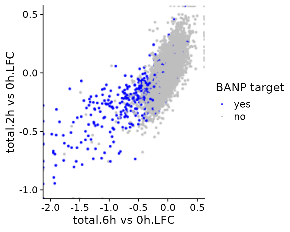
Since in many cases, scatter plots are supposed to show correlated variables, correlation statistics can be easily annotated:
PlotScatter(banp,x=`total.6h vs 0h.LFC`,y=`total.2h vs 0h.LFC`,xlim=c(-2,0.5),ylim=c(-1,0.5),
            correlation = FormatCorrelation("pearson"))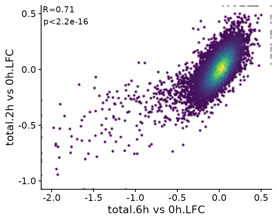
Finally, it is also possible to divide the scatter plot up into multiple panels (ggplot “facets”). Note that the point densities as well as correlation statistics are computed separately per panel.
PlotScatter(banp,x=`total.6h vs 0h.LFC`,y=`total.2h vs 0h.LFC`,xlim=c(-2,0.5),ylim=c(-1,0.5),
            correlation = FormatCorrelation("pearson",n.format="%d"),facet=`BANP-Target`)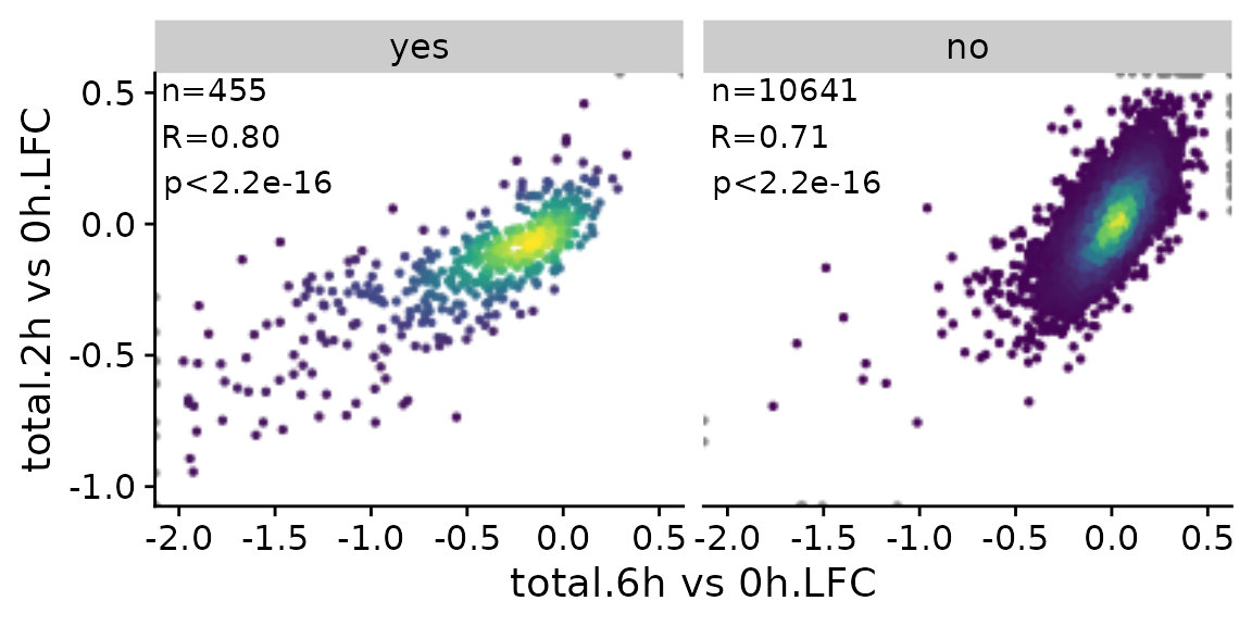
PlotHeatmap
While scatter plots are frequently used to provide a global overview
over two variables, you can use heatmaps to handle more than two
variables. grandR provides the PlotHeatmap function, which
provides convenient access to the ComplexHeatmap
package. In essence, this function does the following
- Call the powerful
GetTablefunction (see the Working with data matrices and analysis results vignette) - Transform the data matrix
- Determine reasonable colors
- Use ComplexHeatmap::Heatmap
sig.genes <- GetSignificantGenes(banp,analysis = "total.6h vs 0h")
PlotHeatmap(banp,genes=sig.genes)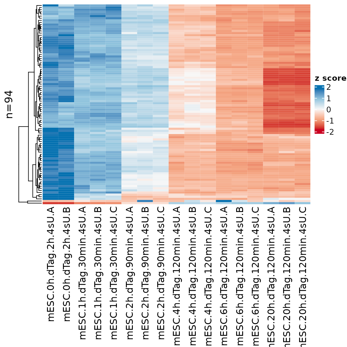
The sample names might be overly long, so it is possible to change
that using the xlab parameter (which works the same way as
for PlotGeneGroupsBars, see above)
PlotHeatmap(banp,genes=sig.genes,xlab=paste(Experimental.time.original,Replicate,sep="."))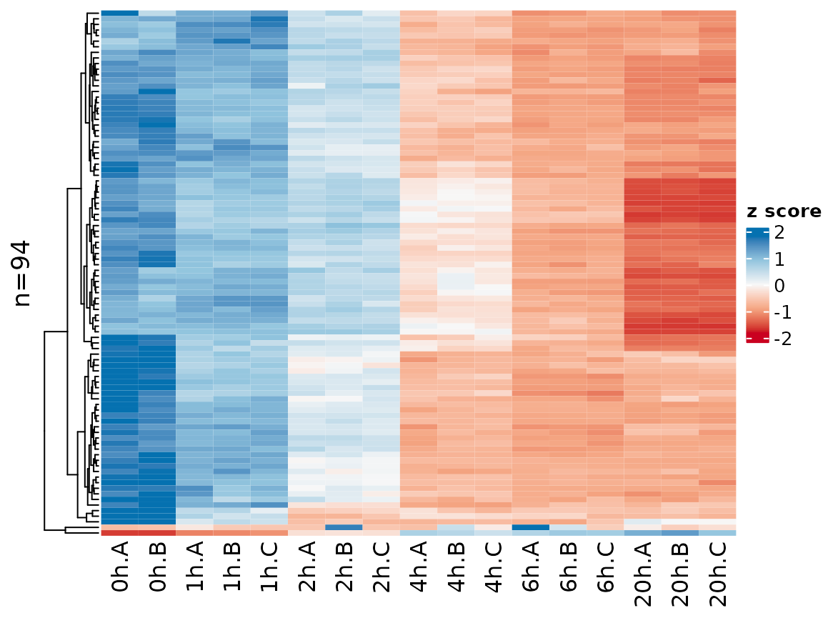
Gene names can be shown by setting the label.genes
parameter to TRUE. If there are at most 50 genes, they are shown by
default:
sig.genes2 <- GetSignificantGenes(banp,analysis = "total.6h vs 0h",
                                  criteria = Q<0.05 & abs(LFC)>2)
PlotHeatmap(banp,genes=sig.genes2,xlab=paste(Experimental.time.original,Replicate,sep="."))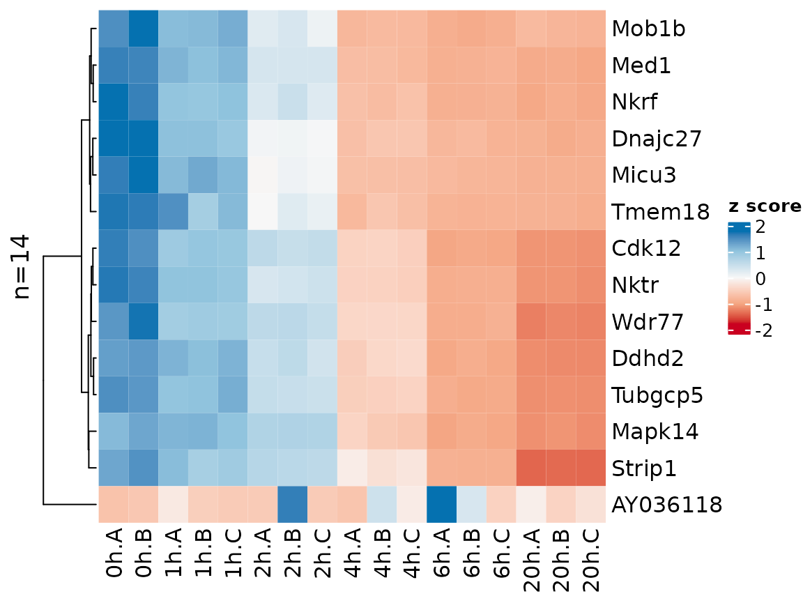
Instead of Z transforming the matrix as per default, here it might also make sense to show log2 fold changes vs the 0h time point:
PlotHeatmap(banp,genes=sig.genes,xlab=paste(Experimental.time.original,Replicate,sep="."),
            transform=Transform.logFC(columns=1:2))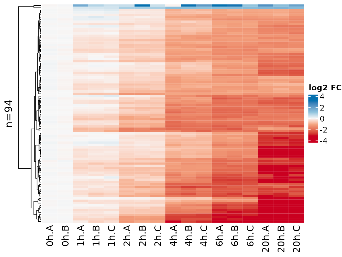
Another option is to transform by using a variance stabilizing function:
PlotHeatmap(banp,genes=sig.genes,xlab=paste(Experimental.time.original,Replicate,sep="."),
            transform="VST")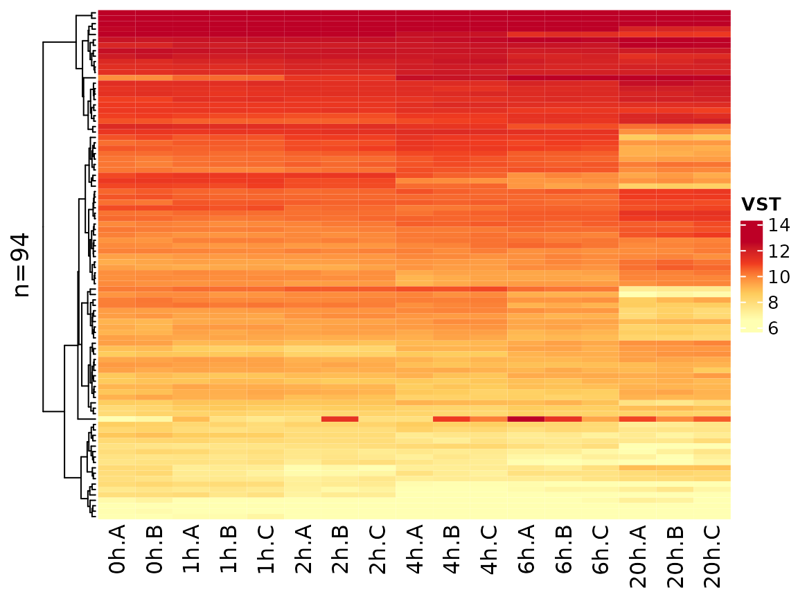
Note that the coloring changed since VST values are not zero
centered. You can change the coloring scheme by the colors
parameter (use any of the colorbrewer palette names):
PlotHeatmap(banp,genes=sig.genes,xlab=paste(Experimental.time.original,Replicate,sep="."),
            colors = "PiYG")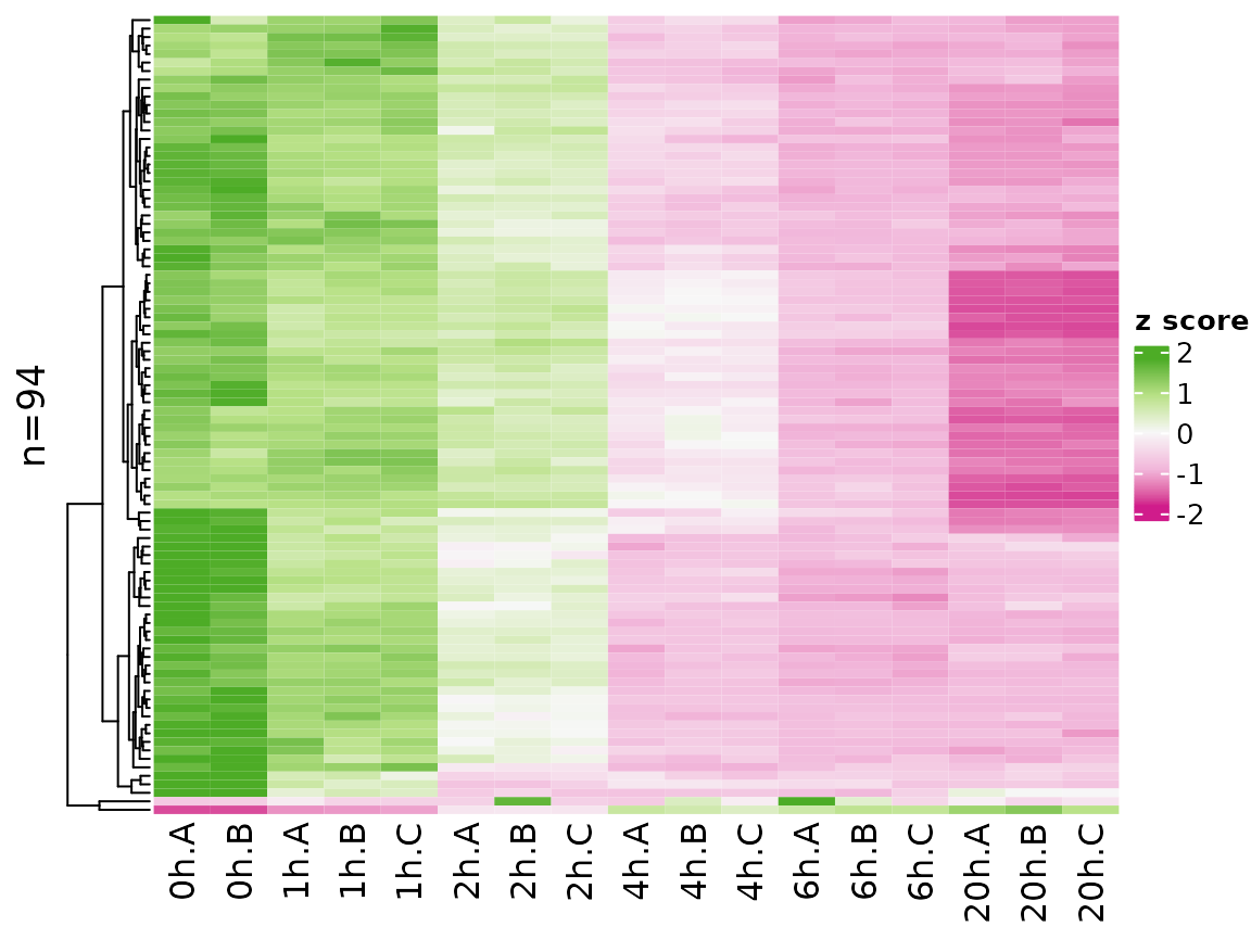
Finally, it is also possible to visualize analysis results in a heatmap:
PlotHeatmap(banp,type="total",columns = "LFC",genes=sig.genes,transform="no")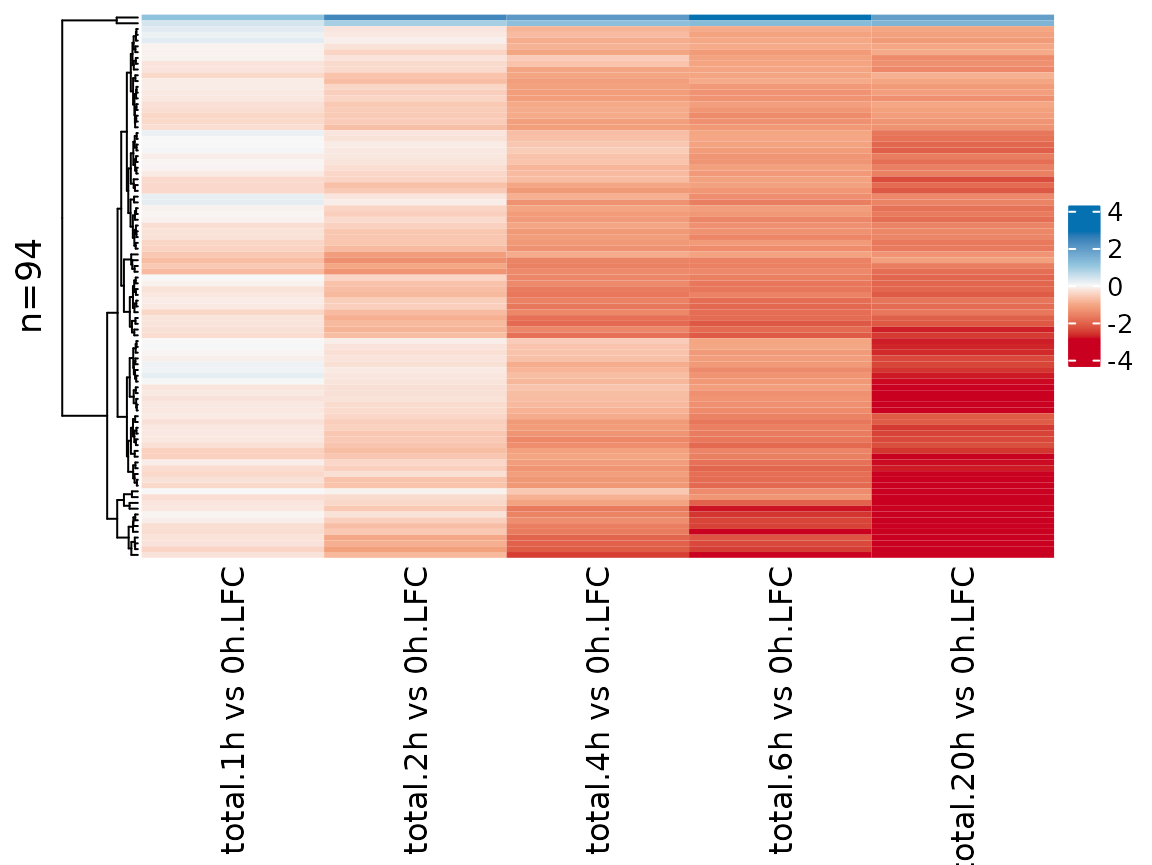
Web-based exploratory data analysis
It is straight-forward to explore grandR data in a web-interface:
ServeGrandR(banp)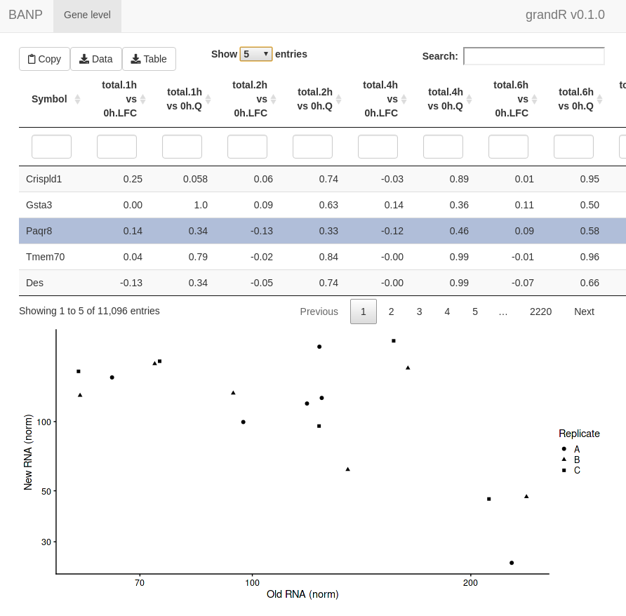
This interface lets you:
- Scroll through a table of analysis results
- Filter this table
- Search this table
- Inspect gene plots when selecting a single gene
- Copy currently filtered gene names
- Download the currently filtered table as tsv file
- Download any data slot or analysis table as tsv file
By default, it will show all Q,LFC,Synthesis and Half-life columns
from all analyses and only show the PlotGeneOldVsNew plot
when a gene is selected. We can change this. First, let’s define a
special analysis named “ServeGrandR”, which only contains the Q value
and log2 fold change from total 2h and 6h, as well as the BANP target
status:
tab <- GetAnalysisTable(banp,analyses = "total.[26]h",columns = "LFC|Q")[,-1:-4]
names(tab) <- sub("total.","",names(tab))
banp <- AddAnalysis(banp,"ServeGrandR",tab)
If this analysis table is present, this is the only table that is
shown. Alternatively, you can set the table parameter of
ServeGrandR to any data frame. Next, we will add two gene
plots:
plotfun.total <- Defer(PlotGeneSnapshotTimecourse,
                     time="Experimental.time",mode.slot="norm",show.CI = TRUE)
plotfun.new <- Defer(PlotGeneSnapshotTimecourse,
                     time="Experimental.time",mode.slot="new.norm",show.CI = TRUE)
banp <- AddGenePlot(banp,"Total RNA",plotfun.total)
banp <- AddGenePlot(banp,"New RNA",plotfun.new)
We use the Defer function here to not store a specific
plot itself, but the function together with several parameters. See
below for more explanation and a template how to use this.
Finally, we will also add a global plot:
plotfun.global <- Defer(PlotScatter,x="total.6h vs 0h.LFC",y="total.2h vs 0h.LFC",
                        xlim=c(-2,0.5),ylim=c(-1,0.5),
                        highlight = GeneInfo(banp,"BANP-Target")=="yes")
banp <- AddGlobalPlot(banp,"2h vs 6h",plotfun.global)
ServeGrandR(banp)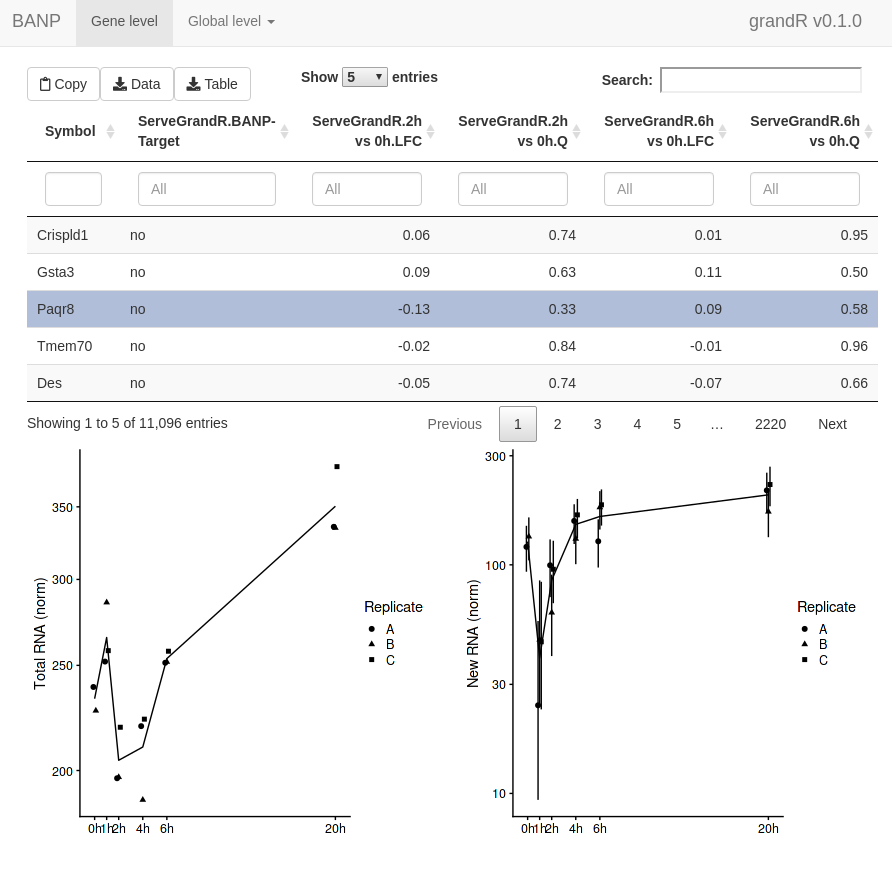 In addition to this
first page, the web interface now has a second tab to show the scatter
plot. This lets you select genes by drawing rectangles with the
mouse:
In addition to this
first page, the web interface now has a second tab to show the scatter
plot. This lets you select genes by drawing rectangles with the
mouse:
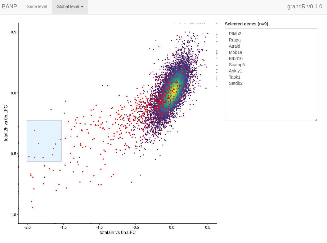
The selected genes are shown in a box, which makes it very easy to copy one of the gene names, switch to the gene level tab, paste the gene name into the search field and look at this particular gene in detail.
Recipe for creating web apps
- Preprocess data as appropriate:
data <- ReadGRAND("https://zenodo.org/record/6976391/files/BANP.tsv.gz",
                  design=c("Cell","Experimental.time","Genotype",Design$dur.4sU,Design$has.4sU,Design$Replicate))
Warning: Duplicate gene symbols (n=34, e.g. Adat3,Dancr,U2af1l4,Sept2,Nudt8,Jakmip1) present,
making unique!
data <- FilterGenes(data)
data <- Normalize(data)
data <- ComputeNtrCI(data)

# quality control, see differential expression vignette
contrasts <- cbind(
  GetContrasts(data,contrast=c("has.4sU","4sU","no4sU"),
               columns=Genotype=="wt",no4sU = TRUE,name.format = "4sU effect"),
  # set up the contrast matrix for compare wt.2h.4sU vs wt.2h.no4sU, as above
  GetContrasts(data,contrast=c("Genotype","dTag","wt"),
               columns=Experimental.time==0,name.format="dTag effect")
  # set up the contrast matrix for compare dTag vs wt without dTAG13 treatment
)
data <- LFC(data,name.prefix = "QC",contrasts=contrasts)

# differential expression, see differential expression vignette
contrasts <- GetContrasts(data,contrast=c("Experimental.time.original","0h"))
data <- LFC(data,name.prefix = "total",contrasts = contrasts)
data <- PairwiseDESeq2(data,name.prefix = "total",contrasts = contrasts)
Warning in AddAnalysis(data, name = if (is.null(name.prefix)) n else paste0(name.prefix, :
Analysis total.1h vs 0h already present! Adding: S, P, Q, Overwritting: M, keeping: LFC...Warning in AddAnalysis(data, name = if (is.null(name.prefix)) n else paste0(name.prefix, :
Analysis total.2h vs 0h already present! Adding: S, P, Q, Overwritting: M, keeping: LFC...Warning in AddAnalysis(data, name = if (is.null(name.prefix)) n else paste0(name.prefix, :
Analysis total.4h vs 0h already present! Adding: S, P, Q, Overwritting: M, keeping: LFC...Warning in AddAnalysis(data, name = if (is.null(name.prefix)) n else paste0(name.prefix, :
Analysis total.6h vs 0h already present! Adding: S, P, Q, Overwritting: M, keeping: LFC...Warning in AddAnalysis(data, name = if (is.null(name.prefix)) n else paste0(name.prefix, :
Analysis total.20h vs 0h already present! Adding: S, P, Q, Overwritting: M, keeping: LFC...
data <- LFC(data,name.prefix = "new",contrasts = contrasts,mode="new", normalization = "total")
data <- PairwiseDESeq2(data,name.prefix = "new",contrasts = contrasts,mode="new", normalization = "total")
Warning in AddAnalysis(data, name = if (is.null(name.prefix)) n else paste0(name.prefix, :
Analysis new.1h vs 0h already present! Adding: S, P, Q, Overwritting: M, keeping: LFC...Warning in AddAnalysis(data, name = if (is.null(name.prefix)) n else paste0(name.prefix, :
Analysis new.2h vs 0h already present! Adding: S, P, Q, Overwritting: M, keeping: LFC...Warning in AddAnalysis(data, name = if (is.null(name.prefix)) n else paste0(name.prefix, :
Analysis new.4h vs 0h already present! Adding: S, P, Q, Overwritting: M, keeping: LFC...Warning in AddAnalysis(data, name = if (is.null(name.prefix)) n else paste0(name.prefix, :
Analysis new.6h vs 0h already present! Adding: S, P, Q, Overwritting: M, keeping: LFC...Warning in AddAnalysis(data, name = if (is.null(name.prefix)) n else paste0(name.prefix, :
Analysis new.20h vs 0h already present! Adding: S, P, Q, Overwritting: M, keeping: LFC...
# add BANP target information
tar <- readLines("https://zenodo.org/record/6976391/files/targets.genes")
GeneInfo(data,"BANP-Target")<-factor(ifelse(Genes(data) %in% tar,"yes","no"),levels=c("yes","no"))- Create an analysis table named “ServeGrandR” as appropriate:
tab <- GetAnalysisTable(data,analyses = "total.[26]h",columns = "LFC|Q")[,-1:-4]
names(tab) <- sub("total.","",names(tab))
data <- AddAnalysis(data,"ServeGrandR",tab)- Come up with useful global plots:
PlotScatter(data,x=`QC.4sU effect.LFC`,y=`QC.dTag effect.LFC`,xlim=c(-1.4,1.4),ylim=c(-1.5,1.1))+
  ggtitle("QC")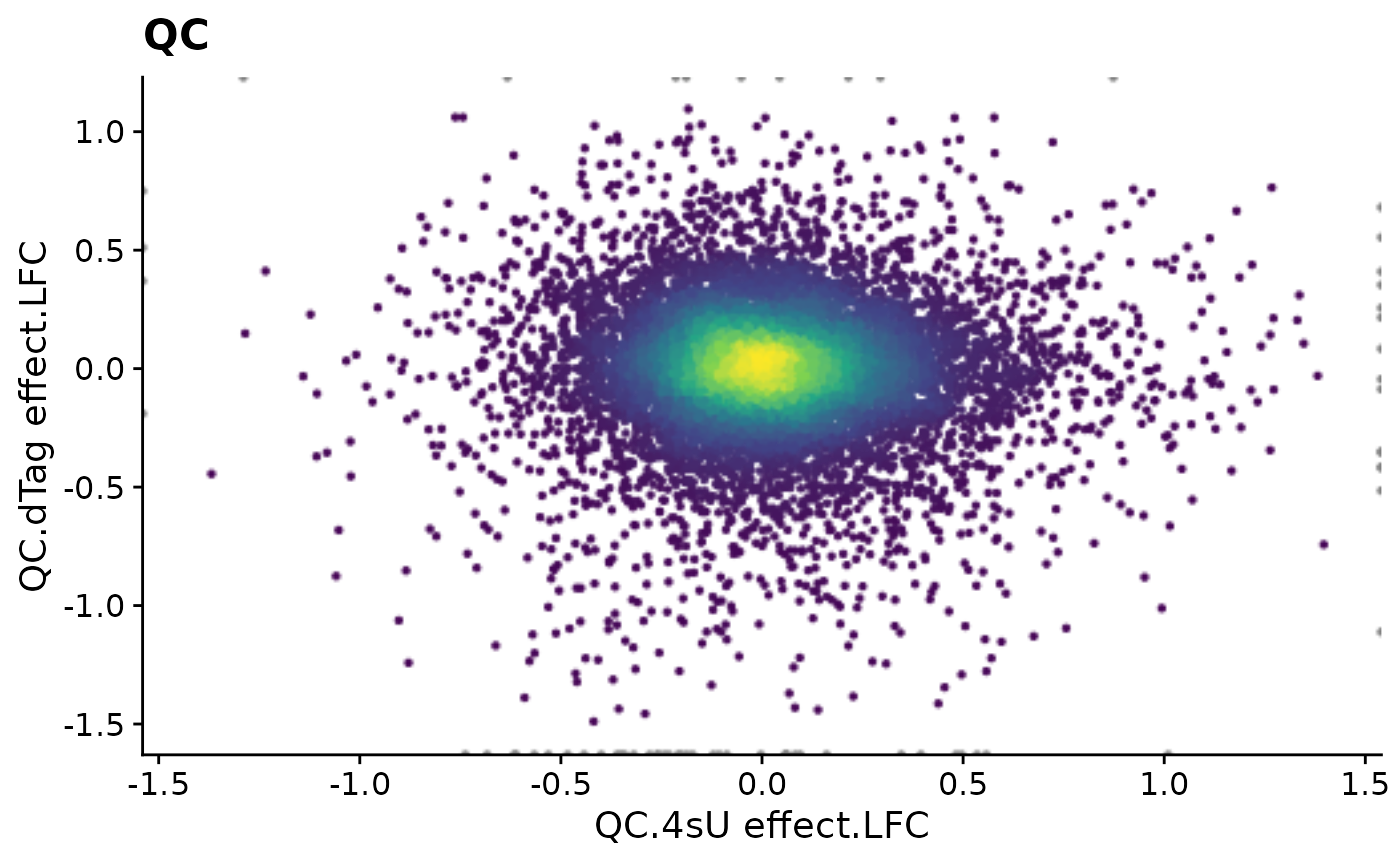
PlotScatter(data,x=`total.6h vs 0h.LFC`,y=`total.2h vs 0h.LFC`,xlim=c(-2,0.5),ylim=c(-1,0.5),
            highlight = GeneInfo(banp,"BANP-Target")=="yes")+
  ggtitle("Regulation")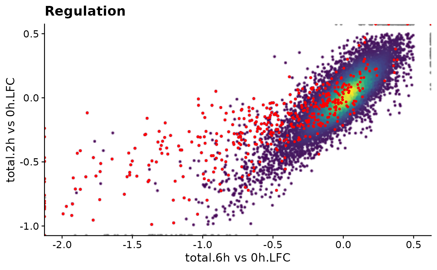
- Add them as deferred plots to the grandR object:
qc.plot <- Defer(PlotScatter,x="QC.4sU effect.LFC",y="QC.dTag effect.LFC",
                 xlim=c(-1.4,1.4),ylim=c(-1.5,1.1),add = list(ggtitle("QC")))
reg.plot <- Defer(PlotScatter,x="total.6h vs 0h.LFC",y="total.2h vs 0h.LFC",
                  xlim=c(-2,0.5),ylim=c(-1,0.5),
                  highlight = GeneInfo(banp,"BANP-Target")=="yes",
                  add = list(ggtitle("Regulation")))


data <- AddGlobalPlot(data,"QC",qc.plot)
data <- AddGlobalPlot(data,"Regulation",reg.plot)
To create a deferred function from the PlotScatter
commands from above, use the following scheme:
It is important that the x and y parameters
of PlotScatter must not be expressions, but characters when
used in deferred functions (note the quotation marks as opposed to the
backticks above).
Do not execute these deferred functions (otherwise they would cache the plot which would increase the file size and loading times in the end).
- Come up with useful gene plots (just test them with an example gene)
PlotGeneGroupsBars(data,"Tubgcp5",columns = Genotype=="wt")
PlotGeneSnapshotTimecourse(data,"Tubgcp5",columns = Genotype=="dTag",
                     time="Experimental.time",mode.slot="norm",show.CI = TRUE)
PlotGeneSnapshotTimecourse(data,"Tubgcp5",columns = Genotype=="dTag",
                     time="Experimental.time",mode.slot="new.norm",show.CI = TRUE)
- Add them as deferred plots to the grandR object as above.
wt.col <- Coldata(data,"Genotype")=="wt"
dtag.col <- Coldata(data,"Genotype")=="dTag"

plotfun.qc <- Defer(PlotGeneGroupsBars,columns = wt.col)
plotfun.total <- Defer(PlotGeneSnapshotTimecourse,
                     time="Experimental.time",mode.slot="norm",show.CI = TRUE,
                     columns = dtag.col)
plotfun.new <- Defer(PlotGeneSnapshotTimecourse,
                     time="Experimental.time",mode.slot="new.norm",show.CI = TRUE,
                     columns = dtag.col)

data <- AddGenePlot(data,"QC",plotfun.qc)
data <- AddGenePlot(data,"Total RNA",plotfun.total)
data <- AddGenePlot(data,"New RNA",plotfun.new)
To create a deferred function from any PlotGeneXYZ
commands from above, use the following scheme:
Again, if any of the parameters are expressions (like
columns above), you need to change this, as this is not
supported by Defer.
Do not execute these deferred functions (otherwise they would cache the plot which would increase the file size and loading times in the end).
- Save your grandR object to a file
saveRDS(data,"data.rds")- Deploy the “data.rds” and the following
app.Ron your shiny server
This server is available here.
Deferred functions
Let’s say you want to show a scatter plot on the web interface:
PlotScatter(data,x=`total.6h vs 0h.LFC`,y=`total.2h vs 0h.LFC`,xlim=c(-2,0.5),ylim=c(-1,0.5),
            highlight = GeneInfo(banp,"BANP-Target")=="yes")+
  ggtitle("Regulation")
First idea is to pre-compute it and store the ggplot object alongside with the grandR object.
plot.reg <- PlotScatter(data,x=`total.6h vs 0h.LFC`,y=`total.2h vs 0h.LFC`,xlim=c(-2,0.5),ylim=c(-1,0.5),
            highlight = GeneInfo(banp,"BANP-Target")=="yes")+
  ggtitle("Regulation")

print(object.size(plot.reg),units="Mb")
19.9 MbThis object is surprisingly large in memory, which means also surprisingly large when written to a rds file, which means also surprisingly slow to load whenever shiny displays the website.
However, it is of course not necessary to precompute it, it can of course be computed on the fly (since all necessary data is there!). A solution would therefore be to just store a function that generates the ggplot:
f1 <- function() PlotScatter(data,x=`total.6h vs 0h.LFC`,y=`total.2h vs 0h.LFC`,
                             xlim=c(-2,0.5),ylim=c(-1,0.5),
                             highlight = GeneInfo(banp,"BANP-Target")=="yes")+
                        ggtitle("Regulation")

print(object.size(f1),units="b")
4088 bytesPerfect, now we can implement our web interface to just call the function when the plot is supposed to be shown:
f1()
time.precomp <- system.time({ print(plot.reg) })[3]
time.f1 <- system.time({ print(f1()) })[3]
Time for precomputed plot: 0.142ms
Time for function: 0.472ms
We can also do this without actually plotting:
time.precomp <- system.time({ plot.reg })[3]
time.f1 <- system.time({ f1() })[3]
cat(sprintf("Time for precomputed plot: %.3fms\nTime for function: %.3fms",time.precomp,time.f1))
Time for precomputed plot: 0.000ms
Time for function: 0.230msThis is quite slow (just imagine you have many plots, more data, or more complicated plots, and the server is already busy; Heatmaps are even worse, actually!). Enter deferred functions:
f2 <- Defer(PlotScatter,x="total.6h vs 0h.LFC",y="total.2h vs 0h.LFC",
                  xlim=c(-2,0.5),ylim=c(-1,0.5),
                  highlight = GeneInfo(banp,"BANP-Target")=="yes",
                  add = list(ggtitle("Regulation")))
print(object.size(f2),units="b")
59960 bytesThis is nothing, and it won’t get larger if you have more complex plots.
time.precomp <- system.time({ plot.reg })[3]
time.f1 <- system.time({ f1() })[3]
time.f2.first <- system.time({ f2(data) })[3]
time.f2.second <- system.time({ f2(data) })[3]
cat(sprintf("Time for precomputed plot: %.3fms\nTime for function: %.3fms\nTime for deferred (1st time): %.3fms\nTime for deferrend (2nd time): %.3fms",time.precomp,time.f1,time.f2.first,time.f2.second))
Time for precomputed plot: 0.000ms
Time for function: 0.236ms
Time for deferred (1st time): 0.226ms
Time for deferrend (2nd time): 0.000msThus, the first time the deferred function is called, the plot is created and then cached, if it’s called again, the cached version is used. This behavior can be further examined using the following examples:
fun <- function(data) rnorm(5,mean=data)
f1=Defer(fun)
f2=function(d) fun(d)
f2(4)
[1] 5.158068 4.463561 5.563719 4.180034 4.236171
f2(4) # these are not equal, as rnorm is called twice[1] 4.448137 3.839901 3.399901 4.253929 4.354675
f1(4)[1] 4.969711 3.771564 3.999355 2.974943 3.858945
f1(4) # these are equal, as the result of rnorm is cached[1] 4.969711 3.771564 3.999355 2.974943 3.858945